


Graphic Design
I’m sure you have seen them: signs that for some reason don’t seem to work. Why? There is a multitude of reasons that seem to all fit into one category – poor design. There are unpleasant signs, illegible signs, signs that are too busy, or signs that just not useful. Sign design is a subset of graphic design that not present in most graphic design schools and classes. There are some specific design elements to sign design that graphic design just doesn’t cover and requires more accurate knowledge than the typical graphic designer knows.
The most important lesson I learned about graphic design is that unless your designs “work” (meaning: grabs your attention, makes you want to read, and tells you what you need to know), then it’s worthless. It doesn’t matter how fancy your sign is, how big it is, or how much it may stand out if it doesn’t “work,” it doesn’t matter! I’ve seen lots of signs or vehicle wraps that look cool or grabbed my attention but were too busy to read, or for other reasons my mind didn’t grasp the information intended. Reasons like: the designer used the wrong font(s), used too many fonts or didn’t utilize the negative space correctly, making the sign difficult or tedious to read. Or, the designer used the wrong colors together, or colors with similar values together, etc.
Some of the important things a graphic designer considers when designing a companies logo and signs:
Function: What does this sign need to do?
Information: What information do I need the person seeing the sign retain?
Color: What colors will look best for this sign (meaning: what colors are optimal for the subject matter, what color will go best with the surrounding scenery as well as will stand out and not be offensive? What colors work best with the other elements of the sign?)
Font: What font(s) will work for this sign (meaning: what will be appealing, what font will read well? What font should be bold and which should be regular or thin?)
There are many more factors designers need to take into account, but these, if not considered, will cause a design to fail!

Other sign and graphic elements, designers consider:
A sign that is effective gets its message across quickly and clearly. For example, a quality street sign typically has few words and is simple. The minimalist sign is for the drivers that have seconds to read and process the sign. Three to five words is a good starting point.
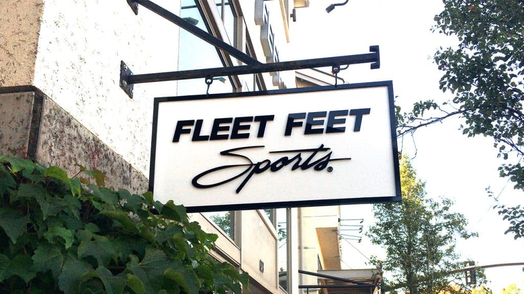
A sign above the entrance of a business should also be simple in its message but can be more attention-grabbing in its layout and color scheme.
Window signs may be read by customers as they walk toward your location and can have more information to inform the customer about sales or specials. It should make a customer want to come in.
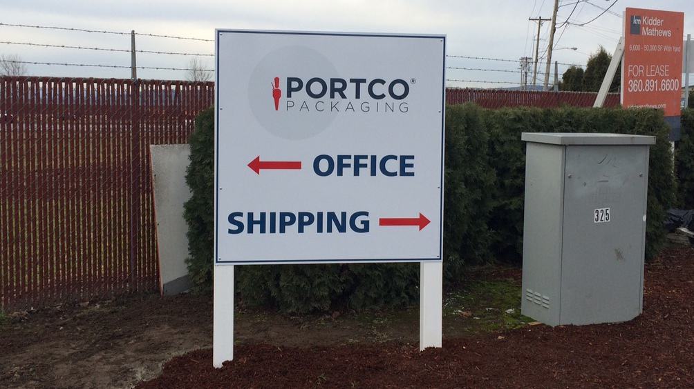
Signs placed at locations where intended targets are walking, rather than driving, can have more information and be more elaborate. Although, they still need to be easy to read and not have so much info that the viewer chooses just to discard it and not read it.
By tailoring the sign to the environment it’s placed in, you will give the sign the best opportunity to do its job!
When Color Goes Wrong:
There are lots of studies about color combinations and what colors stand out or are the easiest to read. While these are good to keep in mind, they should rarely ever drive the color choices for the sign design. A mistake many people make is in thinking that just because a particular combination of colors is the best colors to be read then, it should be those colors on their sign.
But, there are much more considerations in choosing color combinations for graphic design than which colors are easiest to read or stand out the most. For example, what colors are going to make your customer want to buy your particular product? What colors are best given the surroundings? What colors go well with the chosen fonts and images? What colors work with the color scheme in your logo?
Black, dark blue, and red on yellow stand out the most, but they don’t necessarily go well together all the time, or go with certain types of signs and elements. Just using the criteria of what colors stand out the most will cause design failure. Choose colors that make sense for the subject matter and also stand out and make the sign easy to read.
White Space and Negative Space.
One place where many designers make their biggest mistake is in not utilizing white space correctly while creating the negative space of a sign appealing. White space refers to space void of text and images and applies to backgrounds of all color.
White space is needed to make the sign legible. Without enough white space, the sign becomes jumbled and confusing to read. Most of the time people don’t even know why a sign is hard to read, it just is. Difficult to read signs can be a lack of use of white space, which allows the reader time to process the information in seconds. Less is more.
When there isn’t enough white space or dull, negative space, your brain just ignores the sign subconsciously. I combine negative space with white space because they overlap each other, as negative space refers to space around text and shapes and is the area that your eye reads rather than the actual text!
Negative space is one of the most important aspects of making text and shapes work and making them easy to read. Negative space makes the sign interesting or boring, and can ruin an otherwise good design! Negative space makes a font good or bad in a given situation.
Architects are taught about negative space and white space in their design classes more so than graphic designers. They err too far in the “too-much-white-space direction.” A good design utilizes these two factors correctly, and one should end up with a sign that converts prospects into paying customers.
It’s Not All About Looking Cool:
Graphic design and sign design is much more complicated than making something cool or fancy. Well-designed signs and vehicle wraps do more than identify your business. They give your first impression to your customer, as well as impart the information you want your customer to have about you, so hopefully they choose you over your competition! A professional graphics design that works can leave your customer with the information you want them to have about your business and be your absolute best sales aid!
Call NW Sign Solutions today to discuss your project, 360-696-4033
