


How to Design Business Signs That Get Noticed
Last Updated on October 9, 2025
Imagine you’re driving through town, glancing at storefronts as you pass. Some signs blur together: faded colors, hard-to-read fonts, cluttered designs. Then one pops: bold lettering, crisp colors, and a clear message. Without even realizing it, your eyes linger. Maybe you make a mental note to stop by later.
That’s the magic of a well-designed sign. Your sign speaks for you, often before you get the chance to. If you’re wondering how to make a business sign that customers actually notice, it all comes down to design fundamentals. At NW Sign Solutions, we help businesses in Vancouver, WA and Portland, OR bring these essentials to life.
Why Business Signs Matter
Your sign is one of the hardest-working tools your business has. It’s on display 24/7, reaching potential customers long before they step through your door. And for many, it’s the difference between “let’s check this place out” and walking right past.
Studies show most customers have visited a business simply because the sign caught their attention. That means outdoor business signs actively drive traffic and revenue.
Choosing the Right Type of Business Sign
Before you design, decide on the type of sign that makes the most sense:
- Building Signs: Your storefront’s handshake—impossible to miss when done right.
- Monument Signs: Landmark-level signs that guide people from the road.
- Window Graphics: A creative way to share branding, hours, or promotions.
- Banners & Event Signs: Portable, temporary, and perfect for special occasions.
- Vehicle Wraps & Fleet Graphics: Mobile branding that gets noticed anywhere.
Each type of sign can serve a different purpose, but no matter which you choose, the design principles below are what make them stand out.
Design Fundamentals
When you’re designing signage, small choices can make or break its effectiveness. Here’s what matters most:
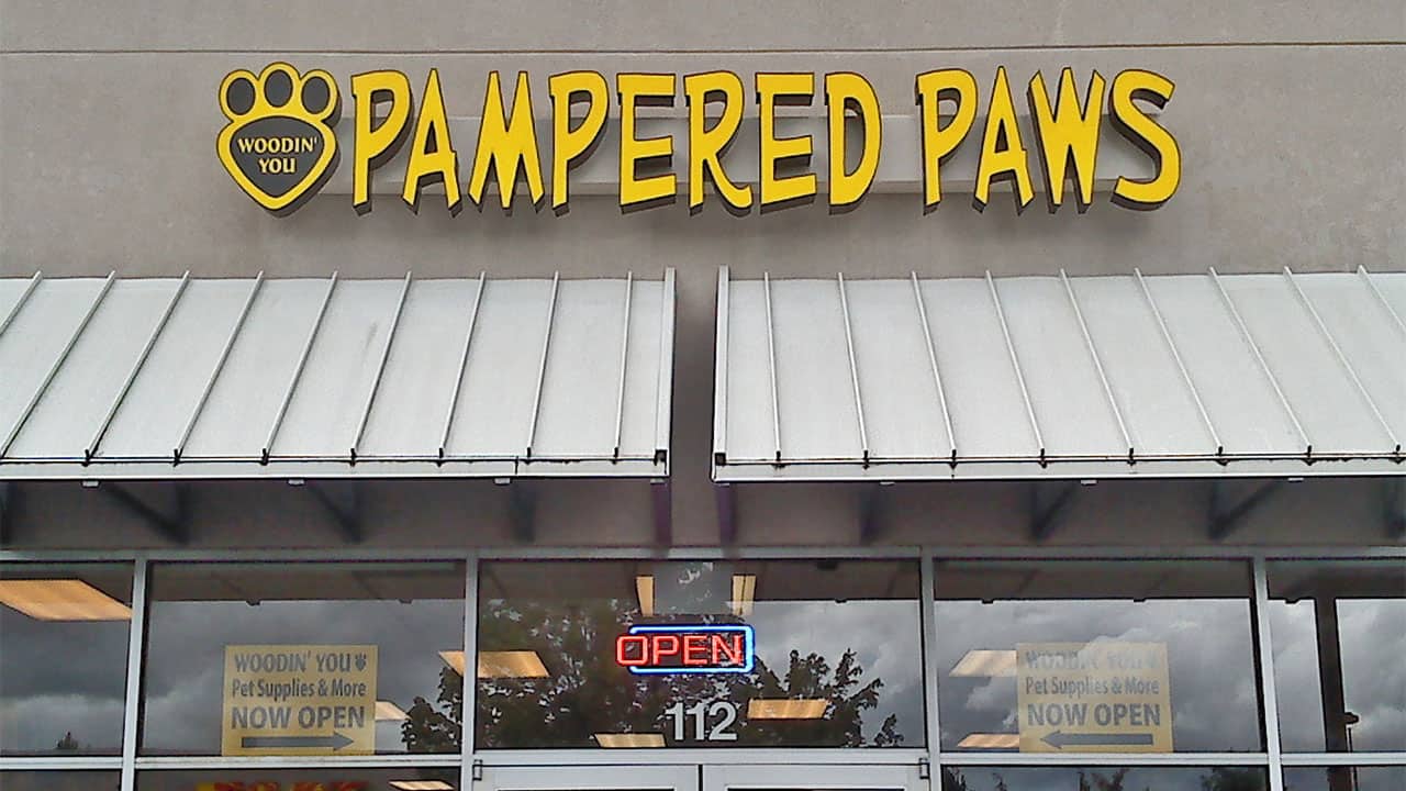
Clarity Above All
Your sign has seconds to grab attention. Keep your message simple and avoid clutter. Think “Business Name + What You Do.” A sign that tries to say everything ends up saying nothing.
Color Contrast
Color choice isn’t just about style, but also readability. Dark text on a light background (or vice versa) is far easier to read from a distance than subtle tones that blend together. Bold contrast ensures your sign doesn’t fade into the scenery.
Legibility
Fancy, script-style fonts might look elegant up close but become unreadable from across the street. Opt for clear, bold fonts that carry your message without confusion. Legibility should always beat decoration.
Placement
Even the best design loses power if no one can see it. Consider sightlines from cars, sidewalks, and neighboring buildings. Avoid placing signs where trees, poles, or awnings block the view. The best placement is where eyes naturally go.
Font Selection
Fonts carry personality, but they also need to serve function. Stick with one or two typefaces at most. Pairing a strong primary font with a subtle secondary one keeps your design professional and easy to scan.
Material Durability
Your sign reflects your brand long after it’s installed. Faded paint, peeling vinyl, or warped boards send the wrong message. Invest in quality, weather-resistant materials—your sign should look as strong on year three as it did on day one.
By focusing on these fundamentals, you ensure your sign not only looks great but also communicates effectively every single day.
From Idea to Installation
At NW Sign Solutions, we walk you through every step so your sign works as hard as your business does:
- We Listen – Your goals, location, and brand identity guide the design.
- We Design – Concepts are created with clarity, contrast, and legibility in mind.
- We Build – Using durable materials that withstand Northwest weather.
- You Approve – Proofs give you confidence before production.
- We Install – Proper placement ensures your sign shines in its environment.
- You Stand Out – With a sign that’s not just visible, but unforgettable.
Mistakes to Avoid
Some common pitfalls weaken signs instead of strengthening them:
- Packing in too much text or imagery.
- Choosing fonts that look good on paper but vanish from 50 feet away.
- Skimping on material quality, leading to signs that fade or peel.
- Forgetting about color contrast and readability.
- Poor placement that hides your sign behind obstacles.
Avoiding these mistakes can be just as important as nailing the fundamentals.
Maximizing ROI From Your Business Sign
Don’t look at your sign as an expense. It’s an investment. To get the most from it:
- Measure results – Track increases in walk-ins or customer mentions.
- Keep it current – Update graphics as your branding or promotions evolve.
- Expand visibility – Add vehicle wraps or banners for greater reach.
- Partner with pros – A sign company that understands both design and durability will save you money and headaches in the long run.
Your business deserves a sign that makes people look twice, not one they forget in a glance. At NW Sign Solutions, we design business signs with clarity, color, legibility, and durability in mind, because those details are what make the difference.
Serving Vancouver, WA and Portland, OR, we’re here to help your outdoor business signs become landmarks. Contact us today to start designing a sign that gets noticed.
Designing a business sign is about smart choices that stand the test of time. When you focus on design fundamentals and work with professionals, your sign becomes more than a piece of décor; it’s your brand’s voice on the street.
