


What Makes a Sign ADA Compliant?
Last Updated on October 9, 2025
Accessibility is the law. Signage plays a critical role in making spaces navigable for everyone. If you’re a business owner, facilities manager, or contractor, understanding what makes a sign ADA compliant can help you stay on the right side of regulations but also show you care about all who walk through your doors.
So, what makes a sign ADA compliant?
In short: It must have tactile lettering, Grade 2 braille, high-contrast visuals, a non-glare finish, and be mounted at a specific height. But let’s go deeper than the checklist. Because compliance lives in the details.
To comply with the Americans with Disabilities Act (ADA), a sign must meet very specific technical standards. These rules ensure the sign can be read by touch or sight, depending on the user’s needs. Here’s what separates a compliant sign from one that simply looks official.
1. Visual Contrast and Finish
Legibility begins with contrast. ADA signs require characters and backgrounds to contrast light to dark or dark to light. The contrast ratio should be high enough that someone with low vision can easily distinguish the letters from the background. While the law doesn’t assign a specific contrast percentage, 70% is often used as a general benchmark.
The surface must also have a non-glare finish. Glossy or shiny materials can render a sign unreadable under certain lighting conditions. That’s why matte acrylics, brushed metals, or textured finishes are the go-to materials for ADA signage.
2. Font Style and Lettering
Forget about curly scripts or stylized fonts. ADA signs require a sans-serif typeface—think Helvetica or Arial—because the clean lines improve readability. All tactile text must be in uppercase, and spacing between characters is tightly regulated.
Font size is dictated by viewing distance. For example, signs meant to be read up close should have characters between 5/8 inch and 2 inches tall. If someone has to read it from across a hallway, the letters must scale accordingly.
3. Tactile Characters and Symbols
ADA-compliant signs must include raised characters that can be read by touch. These letters need to be raised 1/32 of an inch and be smooth to the touch. No sharp edges. No experimental carving. Just clear, consistent elevation and clean lines.
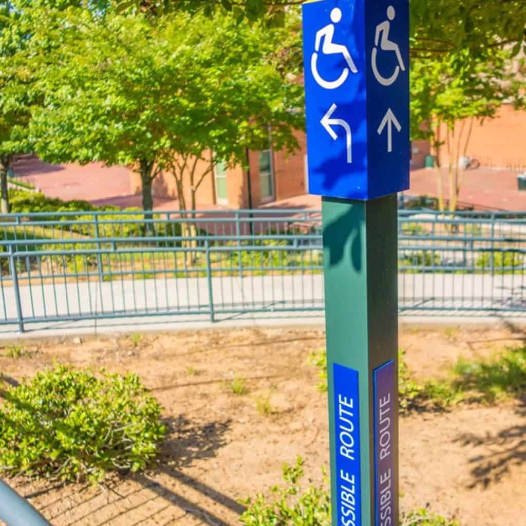
Pictograms like the familiar wheelchair icon are also sometimes required. When used, they must be placed within a 6-inch-high field that is free of any other raised elements.
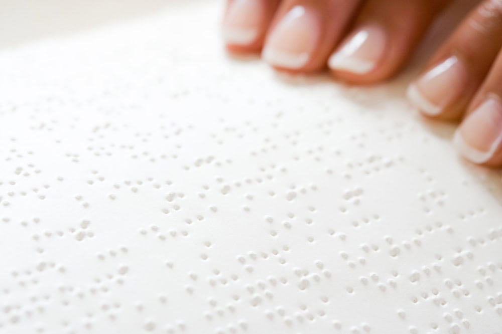
4. Braille Requirements
Braille isn’t optional for permanent room signage. And not just any braille—Grade 2 braille must be used, which includes contractions and abbreviations, making it more space-efficient and standard for readers.
Placement also matters. Braille should be positioned directly below the corresponding tactile text. The dots must be rounded, domed, and placed with precision. Sloppy braille placement or poorly formed dots can render the entire sign noncompliant and completely useless to a blind or visually impaired visitor.
5. Mounting Location and Height
You could follow every rule on materials and formatting, then install the sign too high and still fail ADA inspection. Placement is everything.
Room identification signs (restrooms, offices, etc.) must be mounted on the latch side of the door, with the baseline of the highest tactile character between 48 and 60 inches from the floor. Signs must be located where someone can approach within reach and read them by touch without obstruction.
With sliding doors you can mount directly on the door. But for hinged doors, always place the sign on the adjacent wall.
Not All Signs Require ADA Compliance
Not every sign needs tactile text and braille. Here’s where the law draws the line.
Signs that require compliance:
- Restrooms
- Conference rooms
- Exit doors
- Stairwells
- Room numbers
Signs that do not require ADA formatting:
- Temporary signs used for less than 7 days
- Company logos or marketing signage
- Building directories (unless interactive)
- Menus or nameplates without room designation
Context determines compliance. A decorative lobby sign might not need braille, but the sign identifying the elevator certainly does.
Common ADA Signage Mistakes to Avoid
Compliance can feel like a maze, especially when minor errors can cause big problems. Here are a few missteps that trip up even well-intentioned businesses:
- Using trendy or decorative fonts
- Installing signs too high or outside the approved reach range
- Placing signs on swinging doors instead of adjacent walls
- Applying glossy finishes or colors with poor contrast
- Skipping braille, or worse, using the wrong type
Each of these can lead to failed inspections, legal exposure, or alienated customers. Better to get it right from the start.
ADA Signage Types and Real-World Applications
If you’re visualizing a bland plaque bolted to a wall, think again. ADA signs span a wide variety of settings and styles. Here are a few places where they’re not just helpful, they’re required:
Restroom Signs
Must include tactile lettering, pictograms (like the male/female figures), and braille—all mounted at the correct height next to the door.
Room Number Signs
Every permanent room (offices, classrooms, storage) needs a tactile identifier and braille, even if the room is rarely used.
Wayfinding Signs
These guide users through a space. While not always required to be tactile, they must be clear, easy to read, and placed consistently.
Stairwell and Exit Signs
In an emergency, clarity saves time. These signs must meet visual formatting guidelines to ensure they’re legible for everyone.
Who’s Responsible for ADA Compliance?
Any business or building open to the public must be ADA compliant. It also includes employers with 15 or more employees, architects, contractors, commercial property owners, and anyone responsible for renovations or new construction.
Even minor remodels can trigger the need for updated signage. If you’re touching a public-facing wall, odds are, you’ll need to review your signs too.
Why Work with NW Sign Solutions?
ADA signage doesn’t have to be generic. At NW Sign Solutions, we combine regulatory knowledge with custom craftsmanship. That means you get signs that comply with the law and still reflect your brand personality.
We guide you through everything, from materials and fonts to installation and code compliance. Whether you’re outfitting a brand-new office or retrofitting a historic building, our team builds signs that work hard, look sharp, and pass inspection with ease.
Signs Should Speak to Everyone
When signage is designed with inclusivity in mind, the entire space becomes more welcoming. ADA compliance is an opportunity to create clarity, independence, and dignity for all who navigate your space.
Need help designing ADA compliant signs that reflect your brand? NW Sign Solutions makes the process seamless, stylish, and by the book. Contact us today to get started.
