How to Boost Your Image: Behind the Scenes Logo Change
Last Updated on August 18, 2025
You’ve probably heard the phrase, “Image is Everything.” In the signage industry, this couldn’t be more true. We are in the business of enhancing the images – brands – of companies. We love the opportunity to put a design or logo on a company van, or when we can install a company logo on the building of a new store or restaurant. These, and other types of signage, draw attention to businesses and help to define their brands. Without them, how would their customers know who they are? Or what they do? Or how to find them? And if they’re not doing their job, maybe it’s time for a logo change.
A logo is the image that most consistently represents a brand. It tells the story of your company and is often the most recognizable feature associated with it. It is a visual translation of the personality of your company.
We reflected on our year of ownership of NW Sign Solutions, and we asked ourselves some questions….
Does the logo tell our story?
How can we honor the company’s roots, while creating our own persona?
Would our brand recognition suffer if we made a change? Would our brand recognition suffer if we didn’t?
After answering the questions, we were certain – it was time for a change. After all, as a sign company that prides itself on “Getting Your Business Noticed,” shouldn’t we also make sure that WE get noticed?
The History
When Bev and Joe Goldsby started NW Sign Solutions in 2007, they worked with a designer to create a logo that represented their own vision for the company. They were in Vancouver, Washington, but they wanted to tie-in to the Portland Metro area, so the outline of Portland’s skyline was included. They wanted something that represented the Pacific Northwest and had “dreams of expanding into more northwest regions,” and that translated into the trees and Mt. Hood. The logo served them well and was an accurate representation of the NW Sign Solutions brand.

We’ve benefited from the great relationships the Goldsbys made with customers, and from the excellent standing they have made in the small business community. Their branding worked!
Logo Refresh
Our goal with the logo change was to simplify it and to reflect our personality and vision. We also wanted to honor the work that the Goldsbys had put into the company. This is very important to us and was non-negotiable.
We had long discussions about where we came from and how we got to the crazy title of Small Business Owners. We talked about our mission and brand, and how we wanted to project that to our customers. As a result, we came to the following conclusions:
- The colors needed updating.
- Our roots are in the Pacific Northwest, and it was important to be clear that this is our home. With NW in the name, this was a no-brainer.
- As Washington newbies (and former Oregonians), we wanted to bridge the gap between the two states (more specifically, the gap between Portland and Vancouver).
- We wanted to show continuity between the former owners and ourselves.
- It was of highest importance that we convey that we are a full-service sign company; a one-stop source for enhancing brands.
How did we do it?
Any logo designer will tell you that, for simplicity and for ease of reproduction, a good logo will have 1-3 colors. We decided that we didn’t want more than two. Colors should never be arbitrarily determined. They are meaningful and can have a psychological effect, influencing thinking and reactions. We liked blue as an inspiring, soothing color, and for the fact that it represents the water and the sky. Pairing it with green – a symbol of nature, spring and new beginnings – really appealed to us. We played around with different shades before reaching a final decision.
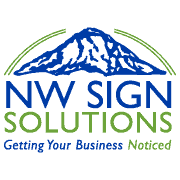
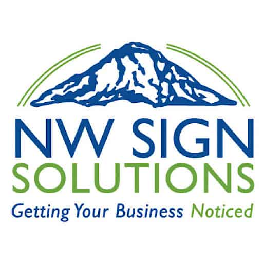
Mt. Hood inspires strength, fortitude and longevity. It is one of the most iconic, if not most beautiful, features of the Pacific Northwest, so it was easy to decide on keeping this graphic.

A bridge was something that seemed obvious to include – “bridge the gap” – but it proved cumbersome in the design and we wanted simplicity. This is where having an in-house designer proved advantageous. The original logo included double lines which Jenn used masterfully. To us, the lines represent the bridge between past and present, the bridge between Portland and Vancouver, and the bridge over the Columbia River which for us, personally, has great meaning. The arcing lines are fluid and convey that from beginning to end, we are a complete source – a solution – for all signage needs.

All the elements were in place. We installed a draft in our lobby and solicited opinions. We conferred as a staff. After many sessions of tweaking sizes and placement, we finalized our new logo. The next challenge was to ensure that everything from our business cards to our website to our social media platforms were all updated with the change.
The Brand Remains the Same
When we took over NW Sign Solutions, we “inherited” everything the business came with, including printers, office furniture and customers (the most wonderful customers, in our humble opinions), as well as the name, logo and brand. We agreed that we would not make drastic changes to ANYTHING so that we could truly get to know the company’s persona. Happily, we determined that the only thing needing a facelift was the logo. Everything else – the reason we exist, the mission, the brand – we felt proud of and wanted to carry forward.
With our logo change, will you see any difference? Probably not. Our tagline is: Getting Your Business Noticed. This is what was done in the past and this is what we pledge to continue to do.
![]()
The Reveal
Now you have the story of our logo change, and we’re excited to reveal it today. As the most visible element of our identity, we truly feel that we have come up with a perfect representation of who we are, while maintaining the integrity of our brand. We hope you like it!
This is it – this is our new logo!

For more information on making a logo change, we suggest you visit 99 Designs.


